Mobile friendliness improves SEO by ensuring your site loads fast, displays correctly, and is easy to use on phones. With Google’s mobile-first indexing, poor mobile experience can hurt rankings, engagement, and conversions. Optimising layout, speed, and usability helps retain users, improve performance, and stay competitive in search results.
Introduction
Google started transitioning to Mobile-first in late 2016 and completed the rollout in 2021. Which means, if your website is not mobile-friendly, it is already too hard for you to compete.
Most websites are losing rankings because their mobile experience may be terrible.
Slow loading, broken layouts, and hard-to-use pages quietly push users away.
With Google using mobile-first indexing, your mobile site is no longer secondary—it’s what determines your visibility. This blog explains why mobile friendliness is crucial to modern SEO.
[image_lm]
What Is Mobile Friendliness?
Mobile friendliness is how well a page works, loads, and displays on smartphones and tablets. If someone has to pinch, zoom, or fight with tiny buttons, the site isn’t mobile-friendly.
A mobile-friendly website should:
- Fit smaller screens automatically (responsive design)
- Load quickly, even on slower mobile connections
- Use readable text without forcing users to zoom
- Have easy-to-tap buttons and links
- Offer simple, clean navigation
Why Mobile Friendliness Matters for Your Brand
With most people browsing on their phones and Google using mobile-first indexing, your mobile version now shapes how well you rank. A smooth mobile experience boosts engagement, conversions, and overall performance. Here’s why mobile friendliness matters for SEO:
- Mobile-first indexing: Google primarily evaluates your mobile version when ranking pages.
- Better user experience: Fast, clear, easy-to-use layouts keep people engaged and reduce bounce rates.
- Higher conversions: Quick-loading pages and easy tap targets help mobile users take action.
- Improved Core Web Vitals: Mobile optimisation supports stronger speed and stability scores.
- Local SEO boost: Most local searches happen on mobile, making a strong mobile experience key for visibility.
- Competitive edge: If competitors have slow or clunky mobile experiences, yours becomes an advantage.
[text_lm]
Core Mobile Issues that Affect SEO
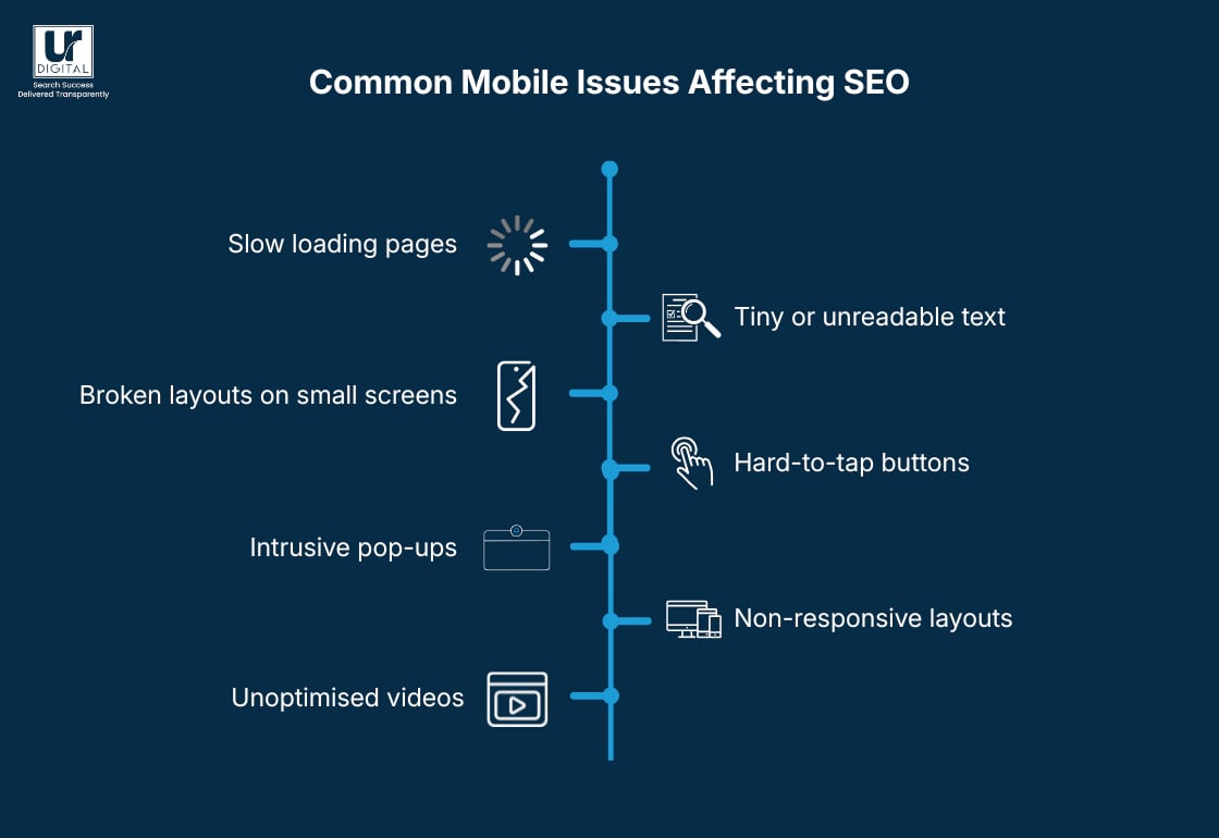
Slow Loading Pages
Pages that take too long to load increase bounce rates and reduce engagement, signalling poor user experience to search engines.
Tiny or Unreadable Text
Text that’s too small forces users to zoom, making content harder to consume and negatively impacting usability.
Broken Layouts on Small Screens
Layouts that don’t adjust properly can cause overlapping content, hidden elements, or horizontal scrolling, frustrating users.
Hard-to-Tap Buttons
Small or closely placed buttons lead to misclicks, making navigation difficult and reducing conversions.
Intrusive Pop-Ups
Pop-ups that block content or are hard to close disrupt the user experience and can lead to higher bounce rates.
Non-Responsive Layouts
Websites that don’t adapt to different screen sizes create inconsistent experiences across devices, hurting both usability and rankings.
Unoptimised Videos
Large or poorly embedded videos can slow down load times and break layouts, especially on mobile connections.
[image_lm]
How to Track Your Site’s Mobile Friendliness
Use Lighthouse
Use Lighthouse in your Chromium Dev Tools and get an instant assessment of how well your pages work on mobile. The tool highlights specific issues like unreadable text or elements that don’t fit the screen.
Review mobile usability in Google Search Console
Search Console shows real errors detected by Google, including tap target issues, layout problems, and content wider than screen. Fixing these directly improves mobile SEO.
Check PageSpeed Insights for mobile scores
Run your page through PageSpeed Insights to see mobile-specific performance metrics like LCP, CLS, and INP. Slow scores here often point to images, scripts, or layout shifts causing trouble.
Test on real devices
Emulators help, but real users browse on real phones. Test your pages on multiple devices (iOS and Android) to spot design, spacing, or interaction issues you may otherwise miss.
Inspect layout at different breakpoints
Use responsive mode in your browser’s developer tools to check how your design behaves across various screen sizes. This helps identify where sections break or overlap.
Track user behaviour data
Tools like GA4 can show mobile bounce rate, scroll depth, and average engagement time. High drop-offs on mobile often signal usability problems.
[text_lm]
Best Practices to Improve Mobile Friendliness
Some of these may seem quite technical, best is to reach out to your developer for assistance or get in touch with us and we can help.
Streamline above-the-fold content
Only keep the most important information visible at the top of the screen. This reduces initial load time and helps users understand the page quickly.
Limit the use of large hero banners
Oversized hero images slow down mobile load times and push key content too far down. Use smaller, compressed visuals or lightweight SVGs or webP instead.
Reduce the number of HTTP requests
Every script, font, and plugin adds load time. Combine files where possible and remove anything that isn’t essential to mobile experience.
Use mobile-friendly forms
Forms should have large fields, minimal required inputs, and auto-fill enabled. Avoid long forms that are hard to complete on small screens.
Enable browser-level caching for mobile users
Caching helps returning visitors load pages faster. Set appropriate expiration times for static resources like logos, images, and CSS.
Avoid unnecessary animations
Animations can look good on desktop but often lag or jitter on mobile. Reduce or simplify them to prevent performance drops.
Choose system fonts where possible
System fonts load instantly on mobile devices. This reduces layout shifts and improves overall speed without sacrificing readability.
Use touch-friendly gestures
Enable gestures like swipe navigation or tap-to-expand where appropriate. This creates a smoother, more intuitive mobile flow.
Optimise for One-Handed Use
Place key elements—CTAs, menus, search bars—within thumb-friendly zones. Many mobile users hold their phones in one hand.
Conclusion
Now that you understand how much mobile friendliness shapes performance and visibility, the next step is to look closely at how your content behaves on different devices. Identify anything that feels slow, cluttered or hard to interact with. Small improvements can make a big difference.
If you’d like support, UR Digital can guide you through your mobile optimisation journey and strengthen your presence further with expert SEO services. Contact us to learn how we can support you.
[image_lm]
FAQs
How do you ensure a website is mobile friendly?
Start by checking how your site looks and behaves on different screen sizes, especially smartphones. Make sure text is readable, buttons are easy to tap, and pages load quickly. Tools like Lighthouse can help spot issues you might miss.
How do I convert my website to mobile friendly?
You’ll usually need to switch to a responsive design so your layout automatically adjusts to smaller screens. This may involve updating your theme, redesigning key pages, or cleaning up bulky elements that slow mobile performance. A developer or modern website builder can make the process much easier.
How to make a website responsive to mobile?
Use a responsive framework or theme that adapts to different screen widths. Set flexible grids, scalable images, and CSS breakpoints so content naturally reshapes itself on mobile. Test often on real devices to make sure everything feels smooth and natural.
Is mobile-first design still relevant?
Yes—more than ever. Since most users browse on their phones, designing for mobile before desktop ensures you’re prioritising the experience that matters most.
How do I optimise my website for a mobile?
Focus on fast loading times, clean layouts, and easy navigation. Compress images, remove clutter, and make sure text and buttons are comfortable to use on smaller screens. Regular mobile testing helps you catch problems before they impact visitors.
How often should I check my mobile performance?
It’s best to review it annually, or especially after design changes, new plugins, theme updates, or content uploads. Mobile behaviour changes quickly, so frequent checks help you stay ahead.
What screen sizes should I test for mobile SEO?
Test across popular screen widths like 360px, 390px, 414px, and larger tablet sizes. Real-device testing is best because mobile behaviour varies between models.
Are sticky headers bad for mobile SEO?
Sticky headers are fine as long as they don’t take up too much screen space or overlap important content. Keep them lightweight and minimal for the best user experience.
Do sliders and carousels hurt mobile SEO?
Not always, but they often slow downloading and can distract users. If you use one, keep it lightweight and avoid auto-scrolling elements that hurt performance.
Are pop-ups bad for mobile SEO?
Intrusive pop-ups that cover content or block the screen can harm both rankings and user experience. Keep pop-ups small, timed, or triggered by user action to avoid issues.
Disclaimer
The contents of this blog are for informational and educational purposes only. They do not constitute professional SEO, GEO, AEO, ASO, or digital PR advice and should not be relied upon as such. We recommend consulting with an SEO expert before implementing any strategies. UR Digital accepts no responsibility or liability for any outcomes resulting from actions taken in reliance on the information contained in this content. Links to third-party websites are provided for reference purposes only. We do not endorse or guarantee the accuracy, relevance, or completeness of their content.